Designing CureMPS
Working with the Hoskins to create the identity system for CureMPS was unlike any of the projects I’d done before. In a landscape where the term “brand” has more or less become synonymous with turning a profit, the Hoskins family is on a very different journey. At the core of their day-to-day life is a commitment to supporting and trying to find a cure for their son Simon, who has Muchopolysaccharidosis (MPS) Type 4A. The Hoskins’ vision for CureMPS is to build a community of awareness and fundraise research into MPS Type 4A, all with the goal of nurturing a sense of hope so Simon can live his best possible life.
The identity system needed to reflect the brief, while also giving a distinct look and feel to the brand so that Simon’s community had something visual to rally behind. I began by learning that the lysosomes within the cells of someone affected with MPS Type 4A were prevented from doing their job because of a genetic inability to break down long-chain sugars. These sugars accumulate to toxic levels which results in skeletal dysplasia, dwarfism, and the deterioration of eyes, ears, lungs and heart. Immediately, the concept of a lysosome struck me as something that could become a strong visual; I remember learning in high-school that lysosomes were responsible for repairing cell membranes, breaking down macromolecules, and fighting harmful viruses and bacteria. This felt like a point of departure for the design concept.

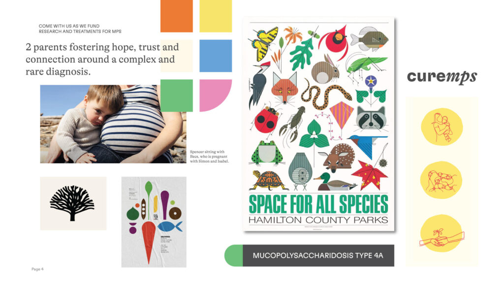
With a brief understanding of MPS Type 4A through the lens of a lysosome, I still needed a visual direction that would unify the branding. At this point, we’d had several meetings in the Hoskins’ family home. Hanging on one of their walls was a print by the illustrator and artist Charley Harper titled “Space for all Species.” Trevor immediately thought of this print when I later asked what art the Hoskins resonated with. Charley Harper is known for portraying nature and animals in a symmetrical, colourful and clean style. His work does a fantastic job of reducing the complexity of nature into only the most important lines – this felt appropriate to the task at hand, of communicating and building awareness around MPS Type 4A.
With the design concept (lysosome) and visual direction (Charlie Harper) making more sense, it was time to jump into the design proper. What began to emerge looked very little like an actual lysosome, but it was a shape, or perhaps a creature, that had the ability to zoom around a cell gathering molecules, a lysosome’s natural work. The concept was named the “Molecular Gobbler;” it felt hopeful, positive, and subtly communicated the effected mechanism of MPS Type 4A. More importantly however, was that this shape could hold many other unique meanings: it looked a bit like a spinal column (MPS affects the spine), but also a plant that was growing and flowering. It was important that a diverse audience could find meaning within this shape, and begin to build their own relationship to CureMPS and Simon’s story.
Alongside the logo are two font pairings, GT Alpina for the logo’s wordmark, and GT Flexa for the majority of the text – both are from renowned foundry Grilli Type. Using these fonts gives CureMPS’s identity a level of credibility and gravitas that shows the seriousness of the disease. Additionally the brand uses 5 colours, has multiple graphics depicting lysosomes gobbling up molecules, and custom icons to further express how MPS Type 4A effects Simon. These brand elements were all created within a style inspired by Charlie Harper for a unified look and feel.
Working with the Hoskins Family has been a truly impactful experience. Their day-to-day tenacity in the face of adversity has inspired my own work, and has shown me how much room I have to grow. Designing an identity for CureMPS was a new and difficult problem for me to solve, but ultimately a pleasure as the final brand looks to bring people together in support Simon Hoksins and his fight against MPS Type 4A.
If you would like to see more of my work, check out Shape Design’s website.
If you would like to donate to CureMPS, click here.
Learn more
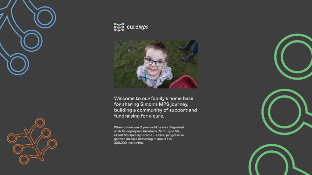
Read our story about MPS Type 4A
and how it has changed our lives.
Stay in Touch
If you want updates from us direct to
your inbox, sign up for our email list.